KAMI is a conceptual museum exhibition on the art of paper folding, best known as origami. For class, we were required to brand an exhibition and create interior, exterior, and narrative literature pieces for the museum exhibition.
This project required a lot of research. I researched the origin and history of origami as well as common, popular colors, styles, and shapes. I chose to highlight the most common shape, the paper crane, and the story of how it became popular through Sadako Sasaski.
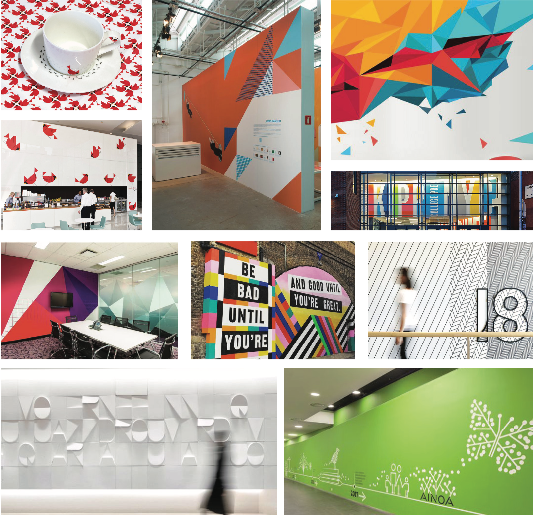
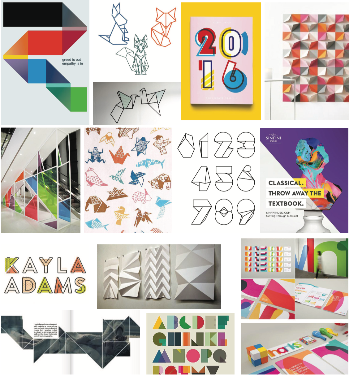
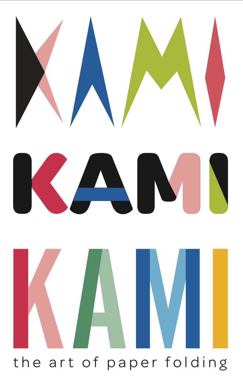
I chose to call the museum exhibition "Kami" simply because it means paper. The dotted line and color choices allude to cut lines and construction paper, often used in crafting projects for young kids. Creating the patterns and paper crane illustrations for this project was so fun. I wanted to mimic the idea of construction paper and cut lines. The fonts are clean and simple for readability purposes and also to allude to clean fold lines by through the use of the color-blocking.
The narrative literature included instructions on how to fold a paper crane along with various square pieces of paper for the visitor to attempt themselves.
Not only did I want this exhibit to be fun for adults, but I wanted to incorporate a fun, playful element for kids to be entertained as well. The colors and fonts chosen create a kid friendly environment, and the environmental wall graphics containing shapes and paper cranes keep their attention as well. The following photos are the original images I used for my exterior and interior mockups, and below that you can see how they were used for the final result.
