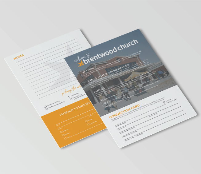
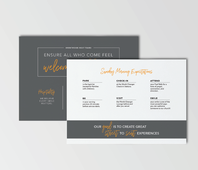
As Brentwood Church (now Waymaker.Church)’s Graphic Design Director for 1.5 years, I worked with the Creative Arts Director to refresh their existing brand and redesign the majority of their signage and print material, in order to create more cohesive visual and written styles. Pieces created as part of the refresh include directional lobby signage, connection cards, various postcards, ministry handouts, brochures, invitations, sermon graphics, and social media content, and their permanent building campaign.
The previous brand consisted of not much consistency besides a heavy use of the orange seen below. I presented the idea of switching to photo heavy branding to the Creative Arts Director, and she was about it. I started photographing almost every Sunday and finding the perfect photos to fit the various pieces we were making. As a church, we knew that showing the faces of our dedicated volunteers and visitors was much more important and sustainable than choosing a color to represent the church.


